UI Components
Total Components
54
Extension Compatible
1
With Gallery
2
With Live Demo
36
Filter by category
Component | Category | Package | Tags | Props |
|---|---|---|---|---|
Alert Alert component for displaying important messages to users. Wraps Ant Design Alert with sensible def... | Extension | @apache-superset/core/ui | Extension Compatible | 5 |
AutoComplete AutoComplete component for search functionality. | Core | @superset-ui/core/components | 1 | |
| Core | @superset-ui/core/components | 7 | ||
| Core | @superset-ui/core/components | 4 | ||
Breadcrumb Breadcrumb component for displaying navigation paths. | Core | @superset-ui/core/components | Demo | 0 |
| Core | @superset-ui/core/components | Gallery | 3 | |
ButtonGroup ButtonGroup is a container that groups multiple Button components together with consistent spacing a... | Core | @superset-ui/core/components | Demo | 1 |
| Core | @superset-ui/core/components | 0 | ||
Card A container component for grouping related content. Supports titles, borders, loading states, and ho... | Core | @superset-ui/core/components | Demo | 6 |
Checkbox Checkbox component that supports both regular and indeterminate states, built on top of Ant Design v... | Core | @superset-ui/core/components | 2 | |
| Core | @superset-ui/core/components | 5 | ||
| Core | @superset-ui/core/components | Demo | 2 | |
| Core | @superset-ui/core/components | Demo | 6 | |
DropdownContainer DropdownContainer arranges items horizontally and moves overflowing items into a dropdown popover. R... | Layout | @superset-ui/core/components | Demo | 0 |
| Core | @superset-ui/core/components | Demo | 12 | |
| Core | @superset-ui/core/components | GalleryDemo | 5 | |
FaveStar FaveStar component for marking items as favorites | Core | @superset-ui/core/components | 3 | |
| Layout | @superset-ui/core/components | Demo | 6 | |
Grid The Grid system of Ant Design is based on a 24-grid layout. The `Row` and `Col` components are used ... | Layout | @superset-ui/core/components | Demo | 4 |
IconButton The IconButton component is a versatile button that allows you to combine an icon with a text label.... | Core | @superset-ui/core/components | 4 |
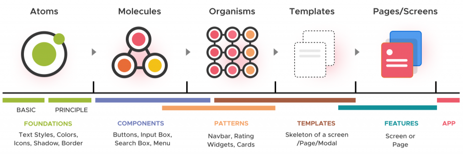
Design System
A design system is a complete set of standards intended to manage design at scale using reusable components and patterns.
The Superset Design System uses Atomic Design principles with adapted terminology:
| Atomic Design | Atoms | Molecules | Organisms | Templates | Pages / Screens |
|---|---|---|---|---|---|
| Superset Design | Foundations | Components | Patterns | Templates | Features |
Usage
All components are exported from @superset-ui/core/components:
import { Button, Modal, Select } from '@superset-ui/core/components';
Contributing
This documentation is auto-generated from Storybook stories. To add or update component documentation:
- Create or update the component's
.stories.tsxfile - Add a descriptive
titleanddescriptionin the story meta - Export an interactive story with
argsfor configurable props - Run
yarn generate:superset-componentsin thedocs/directory
Work in Progress
This component library is actively being documented. See the Components TODO page for a list of components awaiting documentation.
Auto-generated from Storybook stories in the Design System/Introduction story.